
Multi-Dropdown
Select several options using the existing Dropdown in Multi mode.
Create Multi-Dropdown#
Select several options using the existing Dropdown in Multi mode.
The constructor returns a Dropdown handle. The snippet assumes section exists, as created in Quick start.
local multi = section:CreateDropdown({
Name = "Categories", Flag = "categories", Multi = true,
Options = {"Seeds", "Pets", "Compost"}, Default = {"Pets"},
Callback = function(values) print(table.concat(values, ", ")) end,
})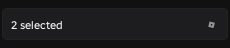 Open full size ↗
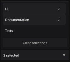 Open full size ↗
Arguments#
| Option | Type | Default | Meaning |
|---|---|---|---|
| Options | {string} | {} | Ordered option list; copied. |
| Multi | boolean | false | Set true for this component mode. |
| Default | {string}? | {} | Initial copied selections when Multi=true. |
| Placeholder | string | "Select an option" | Empty-selection caption. |
| MaxVisibleOptions | integer | 6 | Between 1 and 20; long lists scroll. |
| Callback | function({string}) | nil | Receives an independent selected array in Options order. |
Also accepts common options: Name, Description, Disabled and Callback; stateful controls additionally support Flag, Persist and Sensitive.
Manage state#
multi:SetValue({"Compost", "Pets", "Pets", "Unknown"}, true)
-- GetValue() is {"Pets", "Compost"}: ordered, deduplicated, filtered.
local snapshot = multi:GetValue()
multi:Clear()
Returned methods#
| Method | Returns | Behavior |
|---|---|---|
| GetValue() | {string} | Current {string} value. Returns an independent selected array in Options order. |
| SetValue(value, notify?) | self | Silent by default; true calls Callback only after a changed normalized value. |
| SetDisabled(boolean) | self | Changes user availability without discarding the value. |
| IsDisabled() | boolean | Reads the requested disabled state. |
| Destroy() | nil | Removes this control and its subscriptions; safe to repeat. |
| GetOptions() | {string} | Independent ordered copy. |
| SetOptions(options, notify?) | self | Replaces options and normalizes selection. |
| Clear(notify?) | self | Clears to nil or {} for multi. |
| Open() | self | Requests opening if input is available. |
| Close(instant?) | self | Closes; instant defaults false. |
| IsOpen() | boolean | Reads the logical popup state. |
Behavior and limitations#
Options must be a dense array of nonempty strings. Duplicates are removed while preserving first occurrence order. Selection values are matched exactly, including case.
Only one Dropdown/ColorPicker popup can be open in a Window. Opening another closes the previous popup. Clicking the same trigger toggles genuinely closed/open; the outside handler excludes its trigger.
Placement uses available space. A popup below expands downward with its top anchored; above expands upward with its bottom anchored. Closing reverses toward the trigger, including interrupted tweens.
Outside mouse/touch, Escape, page switch, hide, minimize, disable and Destroy close the popup. Open() returning self does not guarantee that a blocked popup opened.
Multi selections keep the popup open for further choices. Empty selection is {}. There is no CreateMultiDropdown API.
GetValue, GetOptions and callback selection arrays are defensive copies. Removing an option removes it from the selection.
Default and SetValue accept nil or a dense array of strings; wrong types or holes assert. Unknown selections are discarded and duplicates collapse to one choice in Options order. SetOptions retains still-valid choices and reopens an already-open popup when available.